
Apple has recently launched its new unified design language called Liquid Glass for iOS 26 during the highly anticipated WWDC event. This update has stirred a mix of emotions online, with some embracing the design refresh while others voice their discontent. Let’s dive deeper into what Liquid Glass means for users and how it shapes the Apple experience.
What’s the Big Deal about Liquid Glass?
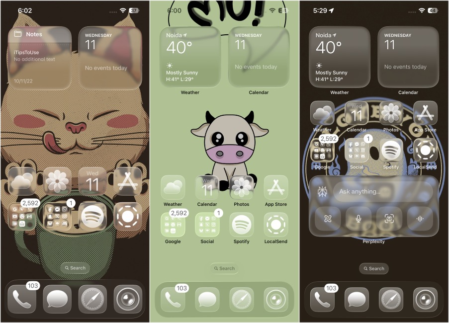
Liquid Glass introduces a translucent overhaul across the entire operating system. You’ll notice this sparkling effect in the Control Center, tab bar, menu toggles, and buttons. Elements now resemble polished glass surfaces, brilliantly reflecting and refracting background light. This design shift signifies a considerable change across Apple’s product lineup, affecting everything from iPhones to iPads.

This innovative material is dynamic, transforming, stretching, and responding as you interact with the interface. Think of it as droplets of water flowing elegantly over your apps and home screen. Apple drew inspiration from visionOS, enhancing the overall aesthetic of the user experience.
Unpacking My Thoughts on Liquid Glass
After witnessing the WWDC presentation, I felt like a kid anticipating Christmas morning, excited to see this leap in design. However, the moment my iPhone loaded iOS 26, I had a pit in my stomach; it felt so unfamiliar and strange.
Initially, I was ready to join the critique swarm online, criticizing the changes. But as the days went by, I decided to delve deeper into Liquid Glass and its features. To my surprise, it wasn’t nearly as bad as I’d feared.

I appreciate the glass motif that brings a consistency across the interface. The previously flat icons now have a bubbly, lively appearance on the home screen. Menus and tab bars float above the full-screen backgrounds without taking up unnecessary space. Rounded edges deliver a modern touch.

The fluidity of the interface captivates me, as pages expand naturally from selections instead of abruptly appearing. As you scroll, tabs and menus adapt seamlessly. Each tap triggers a droplet effect, reminiscent of real water, astonishingly distorting icons in its path.
More Than Just Glass: Some Overlooked Changes
The refresh maintains the simplicity that Apple enthusiasts admire and even builds upon it. Interestingly, certain changes often go unnoticed amid the Liquid Glass excitement. For instance, many apps now include a search bar at the bottom, enhancing accessibility for larger devices.

Additionally, button sizes have been enhanced for easier navigation, ideal for those of us with larger hands. The revamped keyboard resembles Google’s Gboard, and I particularly enjoy the new “Clear” theme that showcases my wallpaper under icons and folders on the home screen.
Seeing Through the Cracks of Liquid Glass
You might be curious why I haven’t addressed the universally criticized Control Center, or the inconsistent spacing in the settings, or even the simplified Camera app. Well, I’ve saved my most critical thoughts for last.
Regarding the Camera app layout, my feelings are mixed. I’m not a fan of the overly simplified look, yet I see Apple’s intention behind it. The updated design encourages one-handed use, allowing users to manage settings with minimal gestures, catering to the casual photographers who make up a vast portion of Apple’s audience.

If you find the Liquid Glass design unappealing, that’s entirely valid; design is subjective. However, it may be too early to critique its elements like the Control Center’s transparency, spacing issues, and app glitches. Keep in mind that this is just the Developer Beta 1 version, and such issues are expected.
Complaining about a raw dish is premature; just give it time to cook. Apple can improve these points in future updates, and I prefer to hold off on my final verdict until the stable build is released. For now, I’m intrigued by the new Liquid Glass design and curious how it will evolve.
Curious about how these changes will affect your iPhone experience? Keep exploring the topic and discover more updates by visiting Moyens I/O. Your journey into the future of Apple’s design starts now!