
Deep in franchise mode, but wondering about a change or pace? Starting your season and looking to do something drastic? Here are all the relocation cities, teams, and uniforms in Madden 25.
All Madden 25 Relocation Cities
You can find the full list of relocation cities for Madden 25 below, along with their market size and personality. To relocation, just go into the Manage Team menu in the Franchise mode home screen, then select Relocate. You will be able to pick from the below cities. Keep in mind that Market Size can be an important factor for getting new players and personality can really impact ticket sales and money.
- Loyal – You can actually get kicked around the field, and these guys will still love you.
- Laid Back – They are slow to react to bad stuff happening, which gives you room to go on a skid.
- Front Runner – They expect to be at the top of the tables, and everything will be good while you are winning.
- Hardcore – They get rowdy if things are not going their way.
| City | Market Size | Personality |
|---|---|---|
| Houston | Huge | Loyal |
| San Antonio | Large | Loyal |
| San Juan | Small | Loyal |
| Oklahoma City | Average | Loyal |
| Toronto | Huge | Loyal |
| London | Huge | Loyal |
| Tokyo | Huge | Loyal |
| Salt Lake City | Small | Loyal |
| Albequerque | Average | Loyal |
| Memphis | Average | Laid Back |
| St. Louis | Small | Laid Back |
| Virginia Beach | Decent | Laid Back |
| Dublin | Decent | Laid Back |
| Anchorage | Small | Laid Back |
| Vancouver | Average | Laid Back |
| Buenos Aires | Decent | Laid Back |
| San Diego | Large | Laid Back |
| Mexico City | Huge | Hardcore |
| Beunos Aires | Huge | Hardcore |
| Omaha | Decent | Hardcore |
| Louisville | Average | Hardcore |
| Chicago | Huge | Hardcore |
| Canton | Small | Hardcore |
| Brooklyn | Huge | Hardcore |
| Melbourne | Huge | Hardcore |
| Honolulu | Decent | Hardcore |
| Portland | Average | Hardcore |
| Rio De Janeiro | Huge | Harcore |
| Austin | large | Front Runner |
| Orlando | Decent | Front Runner |
| Columbus | Large | Front Runner |
| Montreal | Large | Front Runner |
| Paris | Large | Front Runner |
| Oakland | Decent | Front Runner |
All Madden 25 Relocation Teams and Uniforms
One of the things you can do when you relocate is change your team name and uniform to something completely new to embrace your new city rather than dragging your own branding behind you. You can find all the team names and colors below. I am giving each of them a Coolness Rating because I don’t want people making terrible mistakes in their franchise mode.
The Antlers
- Color – Green, White, and Brown
- Logo – An Antler
- Coolness Rating – Honestly, kinda cool. Feels like a throwback to a more classic time for the NFL.
The Armadillos
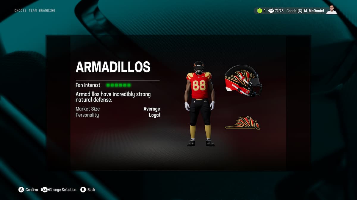
- Color – Red, Gold, and Black
- Logo – I guess it’s supposed to be a highly stylized Armadillo
- Coolness Rating – The name is kinda lame, but the colors are amazing, a classic combo.
The Aviators
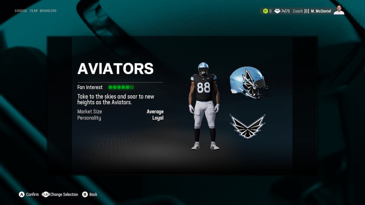
- Color – Black, Blue, and White
- Logo – Wings
- Coolness Rating – Honestly, pretty nice. The colors are classic and pretty neutral. The blue helmet and the dope logo really make it.
The Bisons
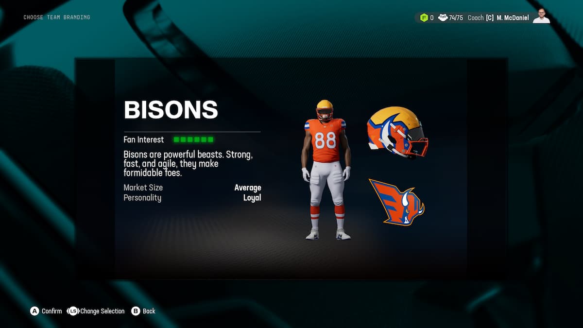
- Color – Yellow, Orange, and Blue
- Logo – a cool stylized Bison head
- Coolness Rating – Yeah, this is a winner. The colorway feels super 80s, but the design and logo feel sleek and modern. I shouldn’t like it because the name is kinda lame, but everthing else elevates it.
The Black Knights

- Color – Black, White, and Red
- Logo – Chess piece Knight
- Coolness Rating – This should work, but it doesn’t. Double names are not it, and the chess piece alluding to advanced strategy is too try-hard.
The Blues
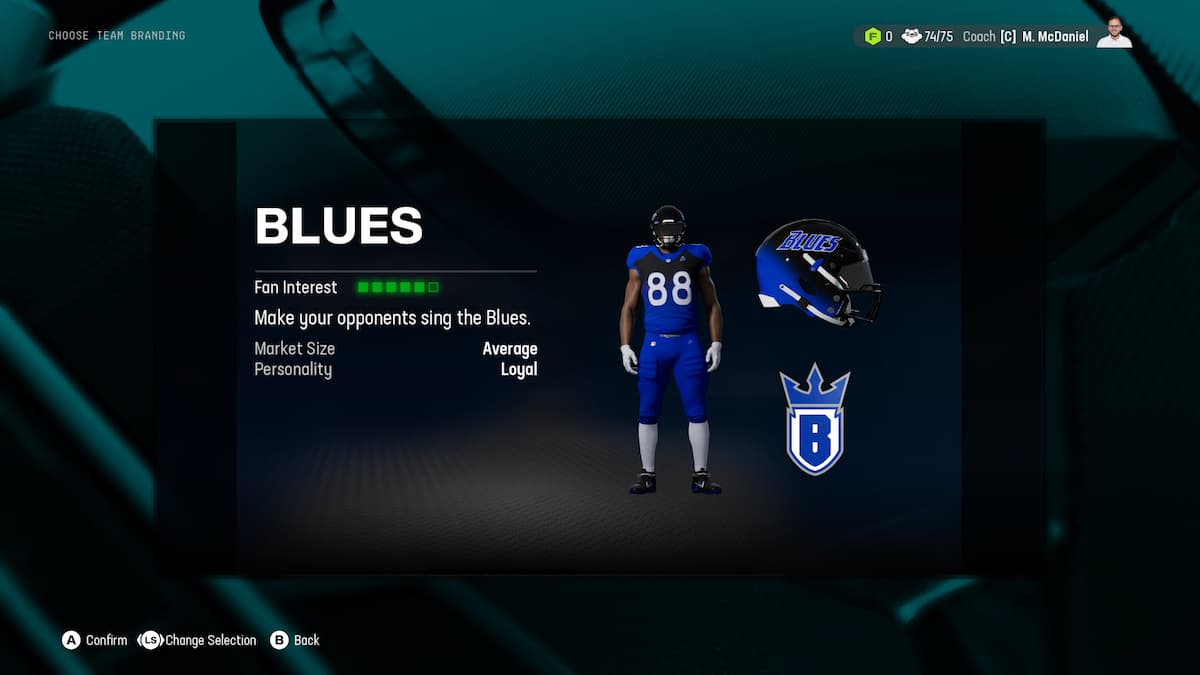
- Color – Blue, White, and Black
- Logo – A “B” with a crown
- Coolness Rating – The logo is a B with a crown on it. I feel like that right there should have sent folks back to the drawing board.
The Bulls
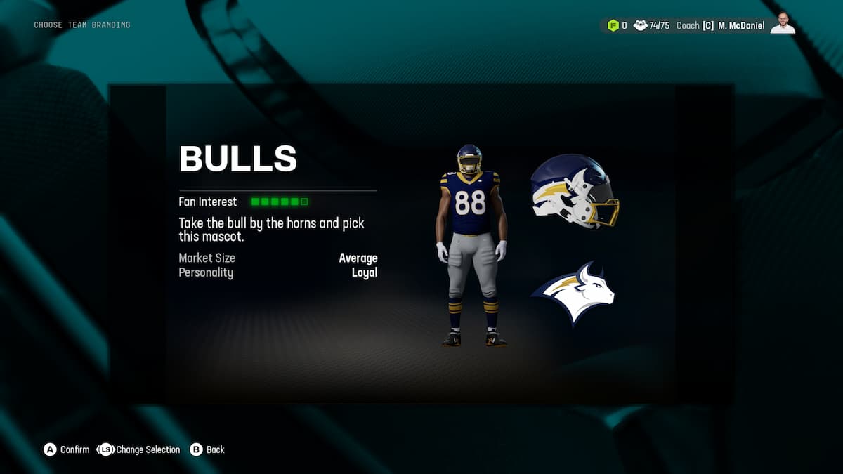
- Color – White, Blue, and Yellow
- Logo – a bull
- Coolness Rating – Once again, a classy vibe. The muted colors are actually nice, although I think this would hit hard with a brighter blue.
The Caps
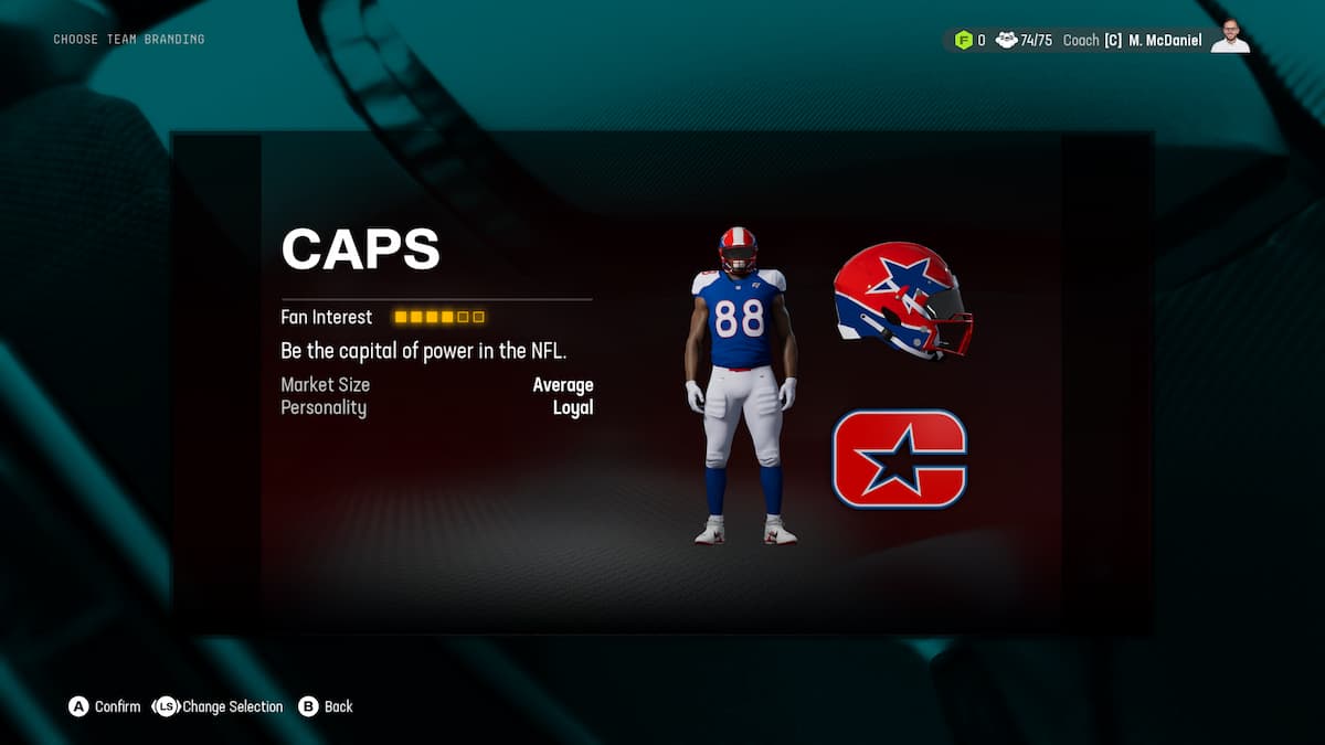
- Color – White, Blue, and Red
- Logo – A C with a star in it
- Coolness Rating – The Cowboys at home
The Condors

- Color- White, Purple, and Black
- Logo – A winged condor with a C on it
- Coolness Rating – The logo feels a little overdesigned, but this is a great look and name
The Desperados
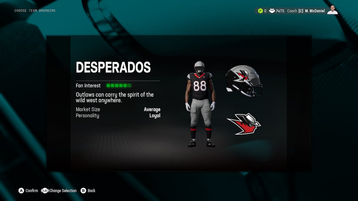
- Color – Black, Grey, Red, some White
- Logo – a man with a bandana on his face
- Coolness Rating – I kinda feel like this entire vibe has been brought into an alley and beaten to death by esports teams.
The Dragons
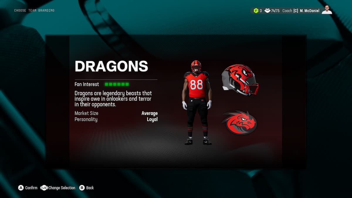
- Color – Red and Black, with some White
- Logo – A cartoonish dragon face
- Coolness Rating – Honestly, I like this one more than I should. The logo is goofy, but I like that for some reason.
The Dreadnoughts
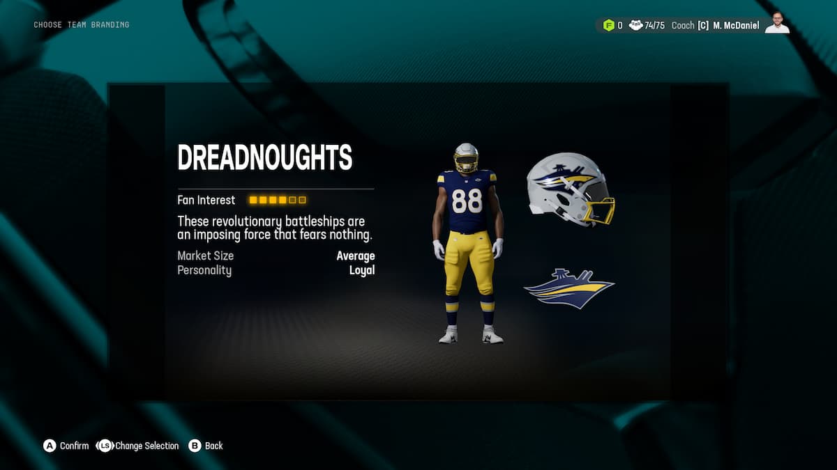
- Color – Blue, Yellow, and White
- Logo – a ship
- Coolness Rating – The name is great, and the colorway is lovely, but the logo is a letdown. I really feel a hyperstylized “D” would have been better here.
The Elks

- Color – Blue, Yellow, and some White
- Logo – An “E” growing Antlers
- Coolness Rating – I really feel like THIS was the time to do an animal head logo, with long antlers that grow all around the back of the helmet from both sides. You dropped the ball, folks.
The Golden Eagles
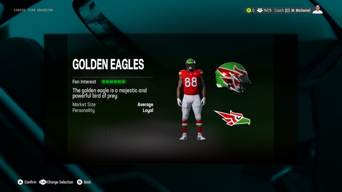
- Color – Red and Green with some White
- Logo – A goofy-looking bird
- Coolness Rating – Double name that is just gonna get shortened to the Eagles, and red and green is always risky because you look like a cartoon frog. Nope.
The Huskies
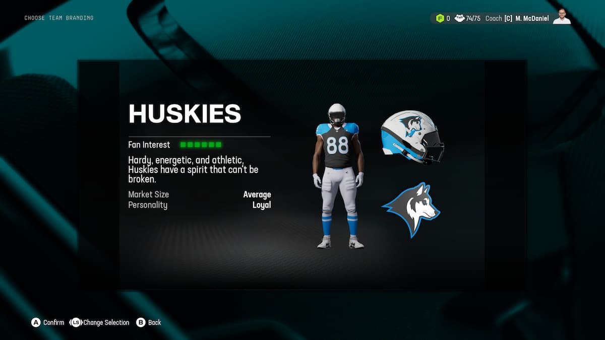
- Color – Blue, Black, and White
- Logo – a nicely done Huskie logo
- Coolness Rating – everything about this is nice, it just feels more like an NHL team than an NFL team.
The Lumberjacks
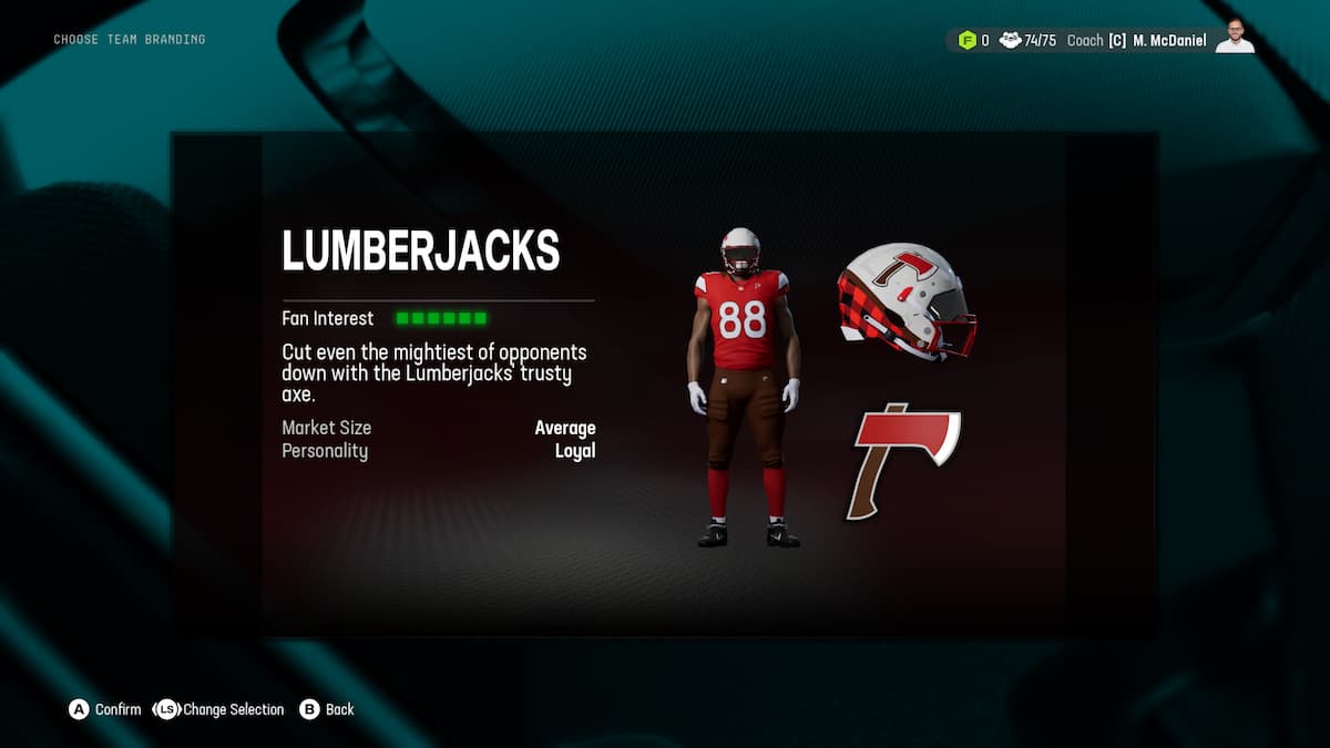
- Color – Black, Red, and White
- Logo – an axe
- Coolness Rating – Another one that is somewhat cooler than it should be. Probably the tartan, which is always a vibe.
The Monarchs
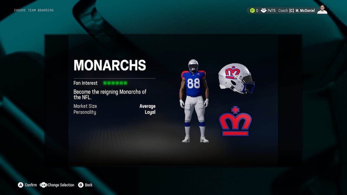
- Color – Blue, White, and some Red
- Logo – An “M” that looks like a crown
- Coolness Rating – I really like this, and it’s a smart logo design to boot.
The Mounties
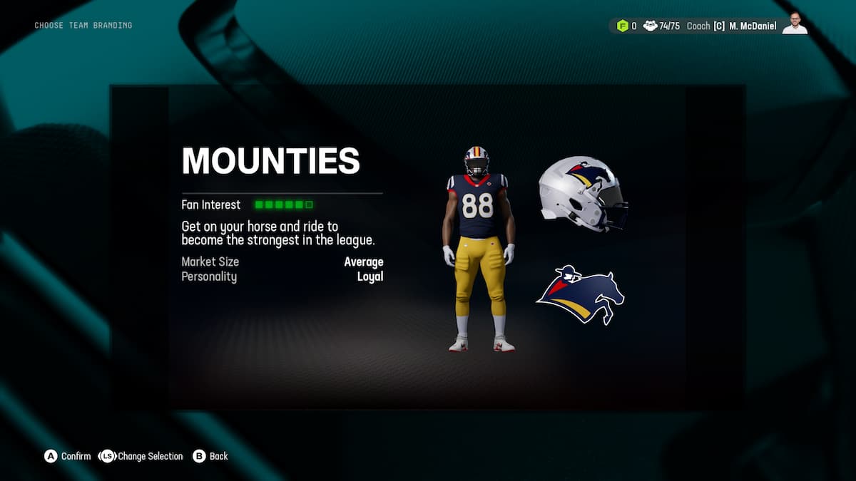
- Color – Navy, Mustard, and Red
- Logo – a literal Mountie
- Coolness Rating – Logo and name are a hard no, but the colorway absolutely slaps.
The Night Hawks
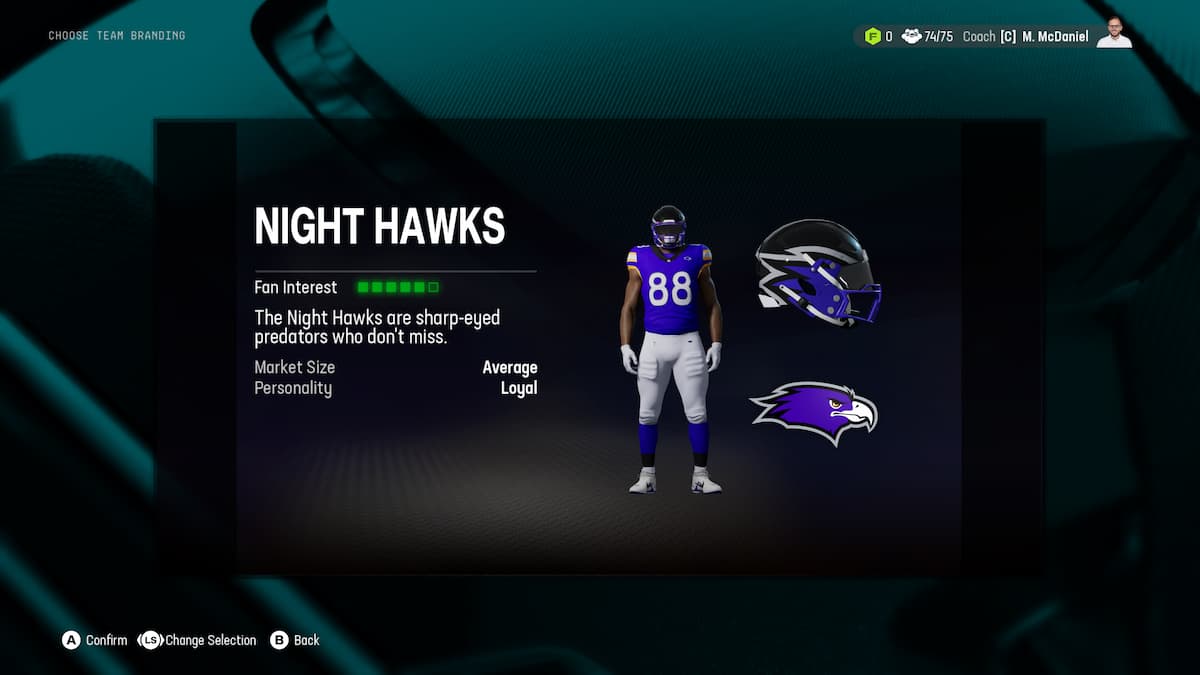
- Color – Blue, grey, and black
- Logo – A hawks head
- Coolness Rating – Double name kills it. The colors and logo are great, though.
The Orbits
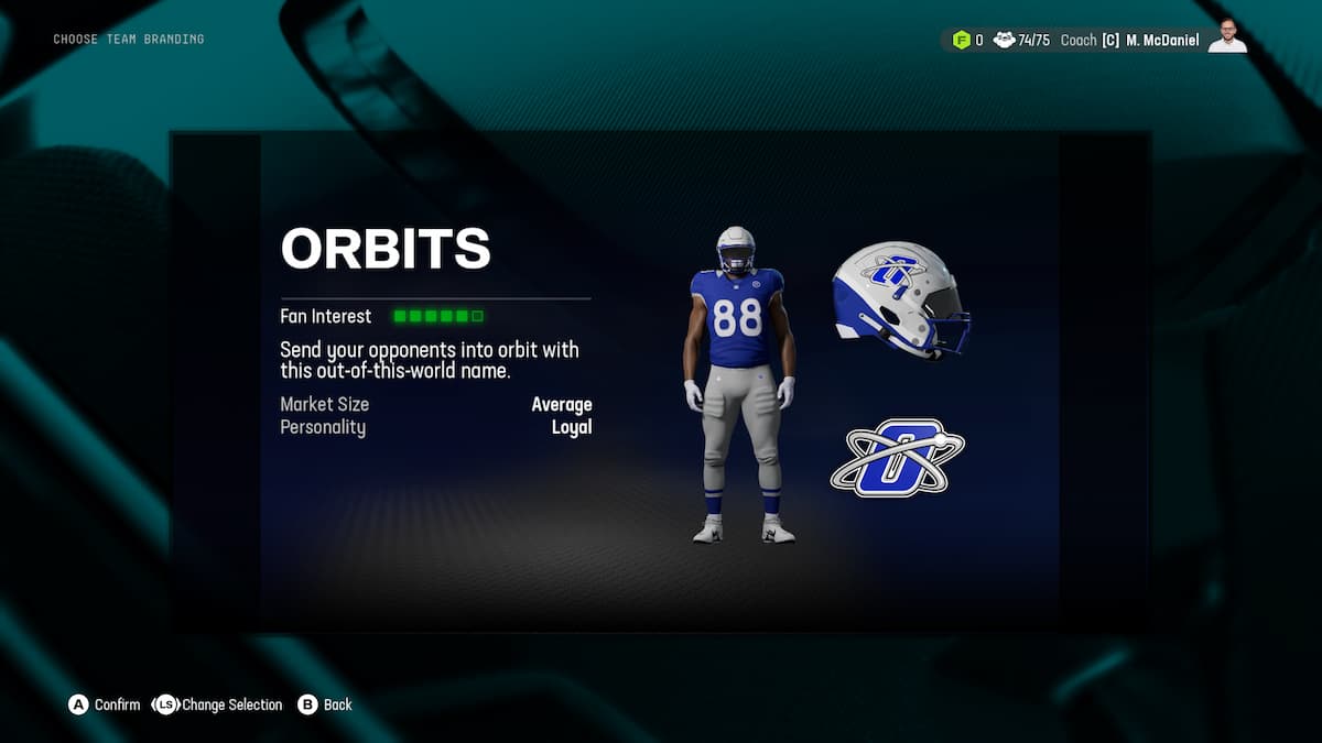
- Color – Blue, Grey, and White
- Logo – And O being orbited by a satellite
- Coolness Rating – Most likely shows my age here, but this is great.
The Pioneers
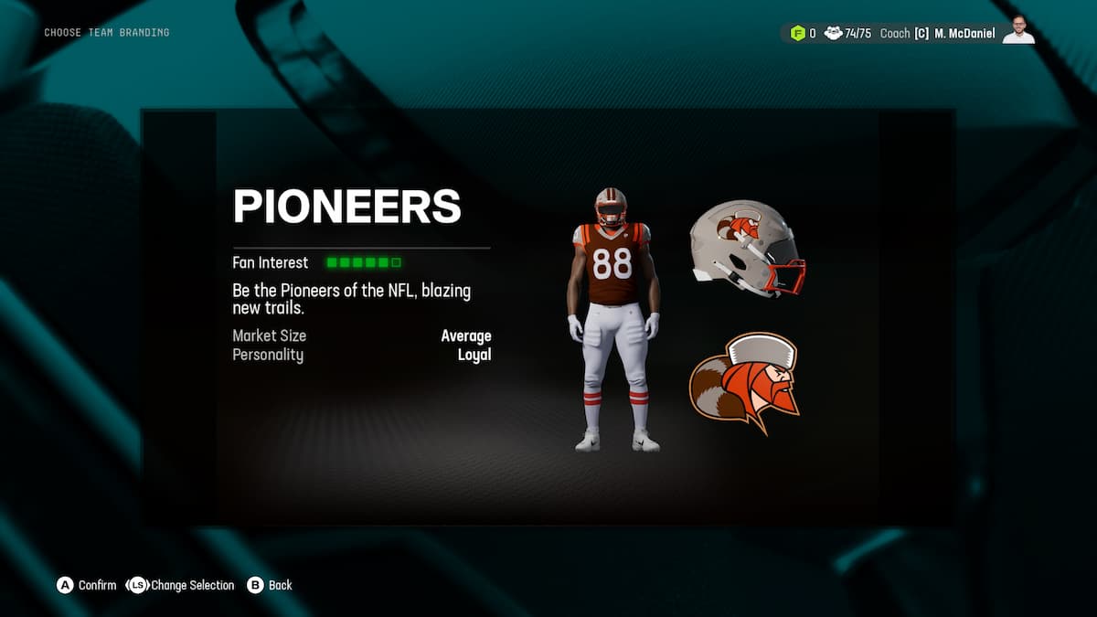
- Color – Brown, Orange, and White with some Grey
- Logo – A very rugged man
- Coolness Rating – The colors are very close to the Browns, but the Chad logo is a win.
The Redwoods

- Color – Green, White, Brown
- Logo – the rings of a tree with a big “R”
- Coolness Rating – Just awful. The name is dope, and the colors are mostly nice, then that logo is just horrible and kills the whole thing. A white helmet with a big canopy of a tree on it would be better.
The River Hogs
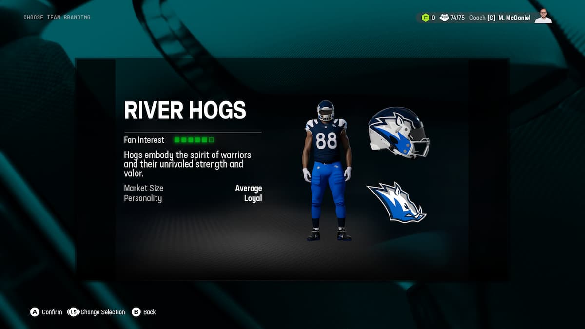
- Color – Navy, Blue, and White
- Logo – an awesome boar head
- Coolness Rating – This is actually incredibly cool, except the name belongs to a high school team from Alabama that nobody believes in, but they end up winning State, not an NFL team.
The Sentinels

- Color – Blue, Grey, and Black
- Logo – A somewhat Trojan inspired helmet
- Coolness Rating – This actually really works for an NFL team.
The Shamrocks
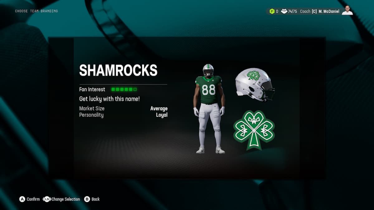
- Color – Green and White
- Logo – A Shamrock
- Coolness Rating – as an Irish guy, I feel this was added so people would make the Dublin Shamrocks, and that ain’t gonna fly. Will at least give Notre Dame grads something to do.
The Snowhawks
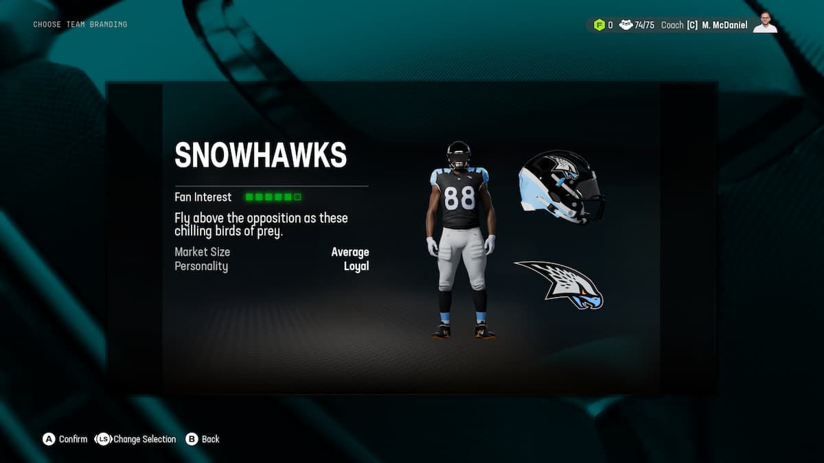
- Color – White, Grey, and some Light Blue
- Logo – The coolest bird head so far
- Coolness Rating – The name is like a special unit in GI Joe, so that’s a win
The Steamers
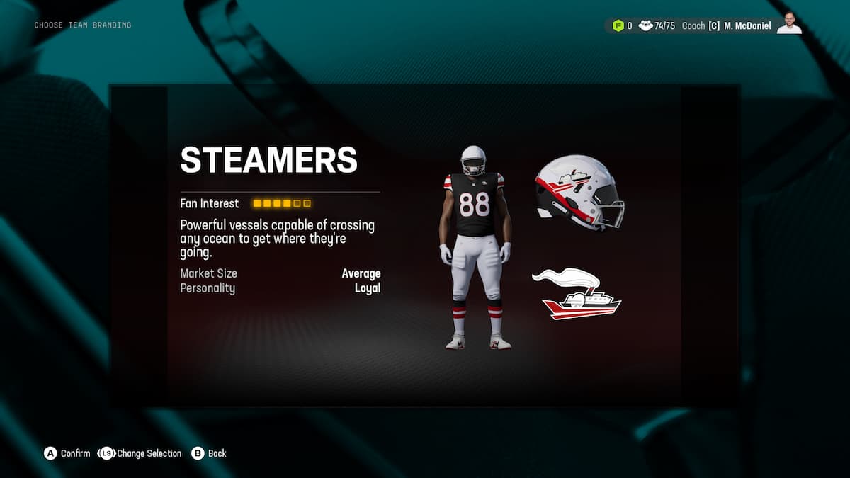
- Color – Black, Brown, White, and some Red
- Logo – A steamboat.
- Coolness Rating – Nope.
The Thunderbirds
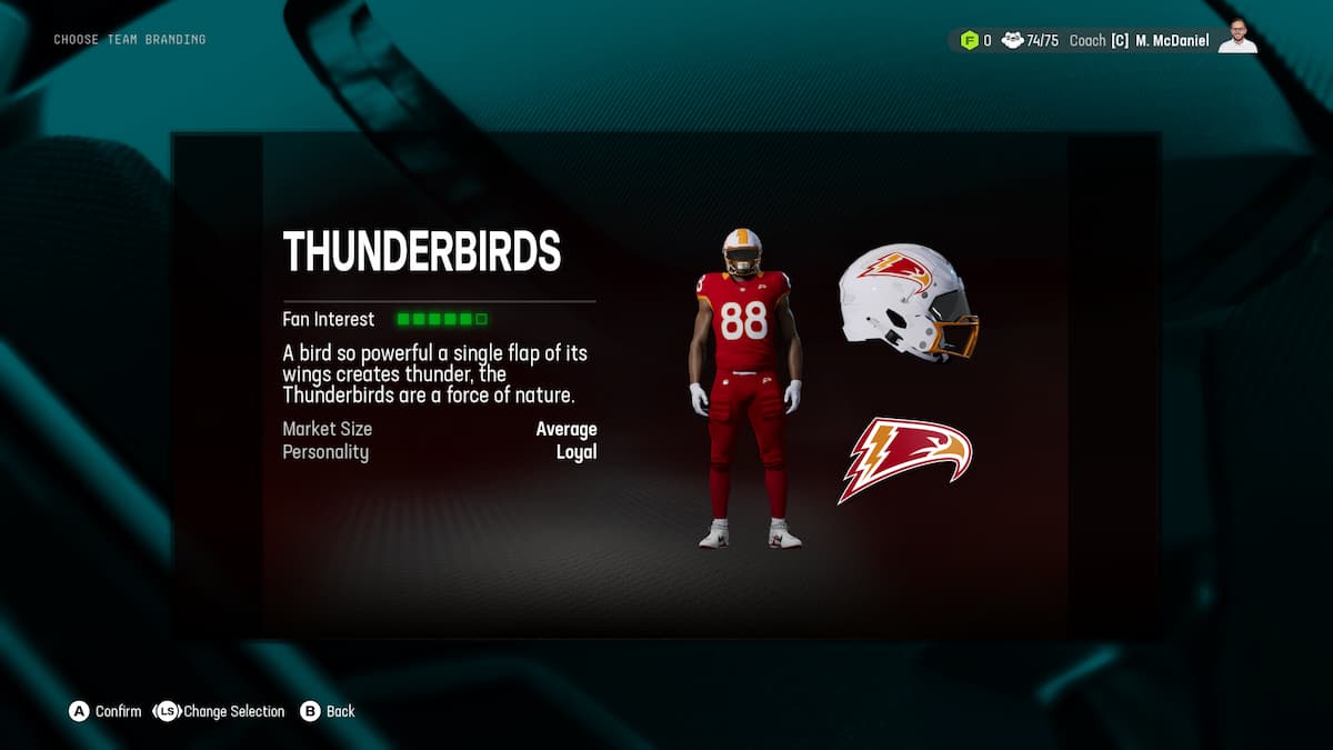
- Color -Red, White, some Orange
- Logo – Yet another bird head
- Coolness Rating – I do really like this one. Outside of a bit of goofiness in the name, this feel like you could run it out of the tunnel in a real game.
The Tigers
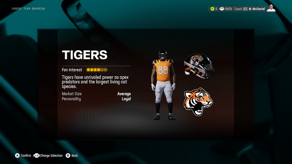
- Color – Blac and Orange with White
- Logo – A Tiger
- Coolness Rating – Overplayed, but I am sure the cereal is lovely.
The Voyagers
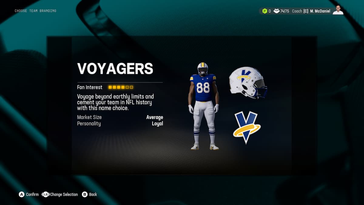
- Color – Blue, White, some Yellow
- Logo – A “V”
- Coolness Rating – Feels like the wrong type of late 80s and early 90s goofy.
The Wizards
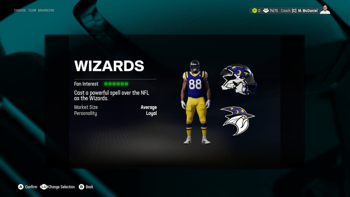
- Color – Blue, Yellow, some White
- Logo – A freaking Wizard
- Coolness Rating – Hell, yes. I also feel like the right announcement team would have incredible fun with this.
And there you go, all your options for when you relocate from one city to another. Make sure you do what is best for your team and your new fans, but you gotta look cool while doing it.
Madden 25 is set to be released on August 16, 2024.