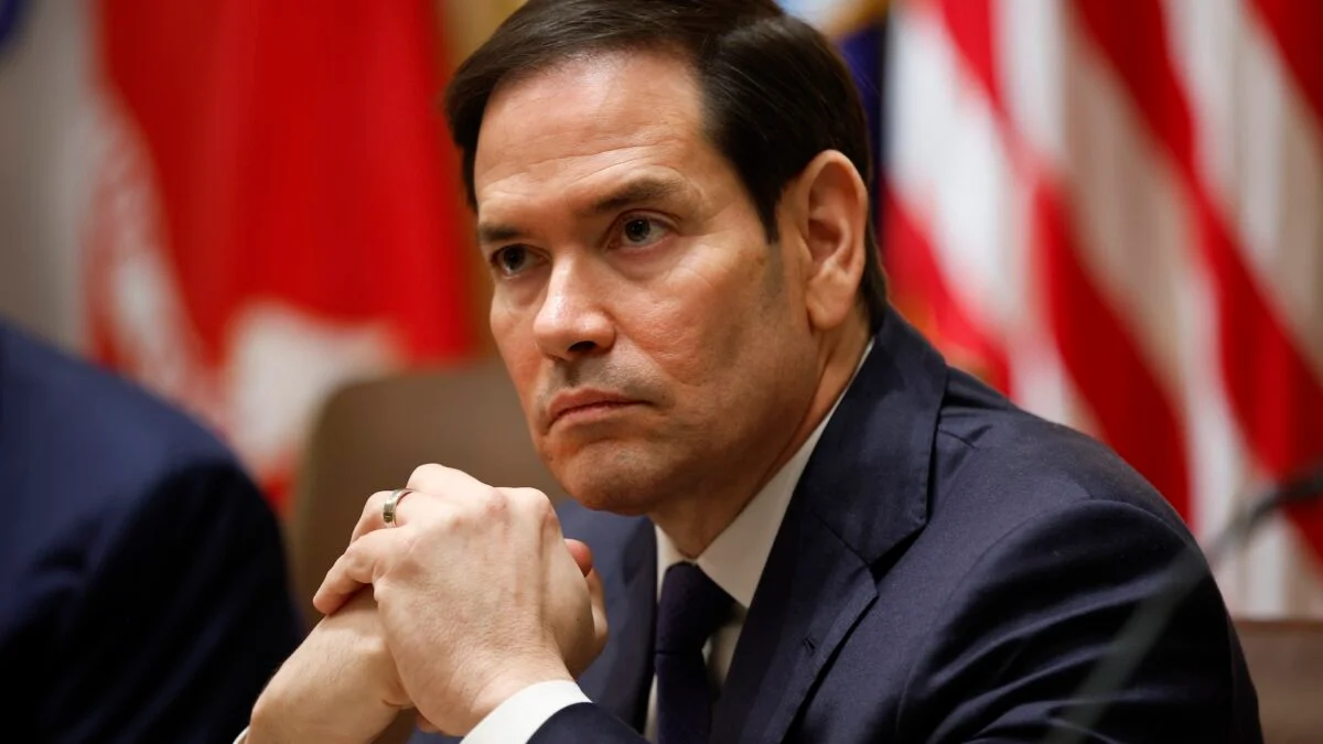
Recently, Secretary of State Marco Rubio made headlines for mandating the use of Times New Roman for all official U.S. State Department documents, as reported by the New York Times. Why this sudden shift? Rubio claims the previous typeface, Calibri, is “too woke” and aims to restore a traditional look to government communication.
This directive was issued in a memo titled “Return to Tradition: Times New Roman 14-Point Font Required for All Department Paper.” According to the memo, the goal is to “restore decorum and professionalism” while abolishing what Rubio refers to as a wasteful DEIA program.
DEIA stands for Diversity, Equity, Inclusion, and Accessibility, and it’s notable that the switch to Calibri in January 2023 was specifically designed to improve accessibility for individuals with visual disabilities. Fonts like Calibri are usually easier to read for those using screen readers or who may have trouble with serif fonts.
It’s interesting to note that Calibri was Microsoft Office’s default font until summer 2023, when they introduced Aptos, another sans-serif font that still focuses on accessibility. This effort aligns with the modern movement toward making digital content accessible to everyone.
Rubio’s announcement has sparked a wave of commentary, especially within the typography community. Many have taken to Reddit to share jokes about the situation, highlighting the seemingly absurd nature of a font war in government settings.
This typeface debate goes beyond mere aesthetics; it reflects ongoing cultural and political tensions. Rubio and other members of the former Trump administration have been vocal about reducing what they consider “DEI” elements in government, echoing a broader narrative seeking to reshape America’s inclusivity standards.
Rubio’s memo emphasized that this formatting aligns with President Trump’s One Voice for America’s Foreign Relations directive. The objective is to present a unified and professional standard in government communications.
The issue of typeface may appear trivial at first glance. However, it symbolizes larger ideological shifts and can alienate marginalized groups. For example, Trump’s administration recently refrained from acknowledging significant events like World AIDS Day and has made changes to national park admission policies that many see as exclusionary.
But what does the font choice say about the government’s values? Will returning to Times New Roman drive away those who seek a diverse and inclusive environment? This small decision could have a ripple effect, impacting perceptions of the administration’s openness.
Is there a better alternative for readability in official documents? Many experts agree that sans-serif fonts like Calibri or Aptos offer advantages for clarity and accessibility. These fonts support various technologies aimed at helping individuals with disabilities.
Should public communications prioritize traditional aesthetics over accessibility? In an increasingly diverse society, prioritizing accessibility can enhance communication and foster inclusivity. Upholding readability standards is essential for effective public engagement.
Can font choices really reflect broader political agendas? While it may seem trivial, typography is often intertwined with cultural narratives and perceptions of professionalism—a factor that could contribute to a more exclusive environment for certain communities.
Ultimately, while Rubio’s memo might seem like a minor issue, it is part of a larger pattern that can influence societal norms and expectations. As we navigate these complexities, it’s essential to weigh the benefits of tradition against the importance of inclusivity.
For more in-depth explorations of technology, culture, and politics, continue to engage with quality content. Visit Moyens I/O at https://www.moyens.net to dive deeper into topics that matter to you.