
I was standing under a dying arcade sign when a stack of old game boxes caught my eye — each one screamed a promise. You’ve held these covers in your hands: the glossy lie, the honest grit. I’ll show you why they mattered then and why they still do now.
I’ve followed this series since DMA Design handed the torch to Rockstar North, and I’ve watched the art go from street photographs to an iconic style that sells a billion-dollar franchise (≈ $1B / €940M). Read this like a collector’s guide and a field report — you’ll see patterns, favorites, and a few surprises.
How have GTA covers changed over time?
You can trace the series’ design choices like a timeline in a museum — each cover carries the era it came from. Early entries used real photos; GTA 3 swapped photos for a panel grid and the Pricedown logo that defined the brand. From top-down snapshots to tightly composed character collages, the covers shifted with platform capabilities (PlayStation, Xbox, Nintendo DS, PSP, iOS, Android) and Rockstar’s appetite for cinematic marketing.
Who designs GTA cover art and why does it matter?
I met an art director once who told me, “The game’s cover is a contract with the player.” Rockstar Games and their in-house teams — plus outside artists early on at DMA Design — craft these images to promise tone, place, and threat. The type, the characters, even the helicopter placement communicates what the game will feel like before you boot it.
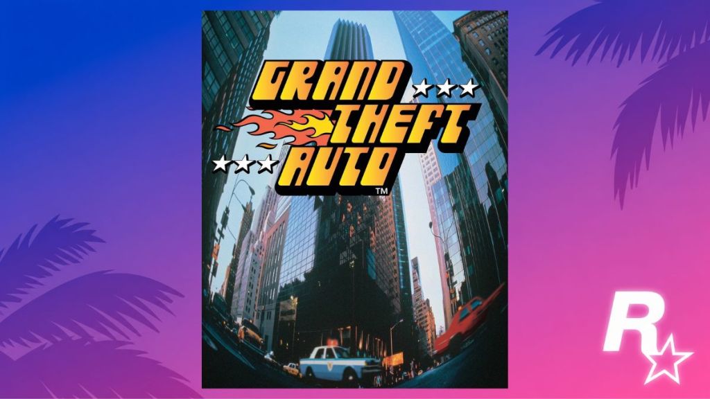
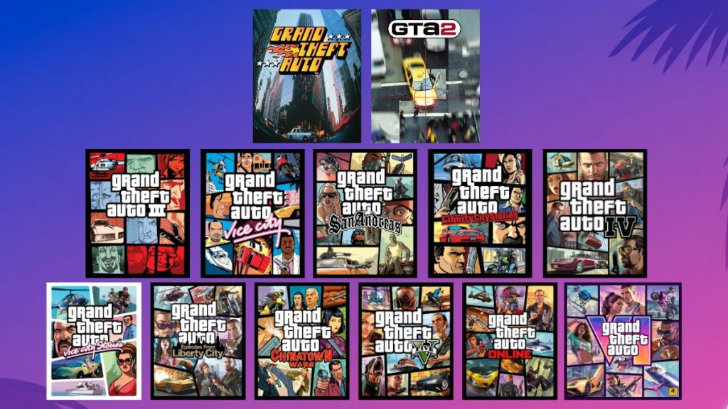
GTA 1 (1997)
The box sat beside PS1 titles in a small shop window, its yellow logo catching the light.
GTA 1 arrived in October 1997 as a top-down open-world oddity. The cover was a real photograph of the New York skyline shot through a fisheye lens. That slightly bent city view, with a bold yellow-and-orange logo, promised scale and grit. Stars for the wanted meter flank the title; flames lick the word “Theft,” hinting at speed and getaways. It felt like a snapshot of urban chaos — candid and raw.
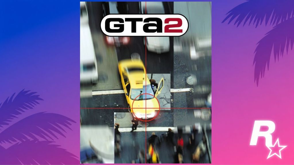
GTA 2 (1999)
I remember a friend zooming in on a cover and pointing at the reticle — “that’s the tone,” he said.
Released in October 1999, GTA 2 kept the top-down view but moved the setting into a retrofuturistic city with competing gangs. The cover is another real photo, this time framed like a sniper’s sight locking onto a taxi. The blurred chaos around the crosshair signals escalation; black-and-red type announces the sequel. It’s tightly focused violence, a short, sharp promise of mayhem.
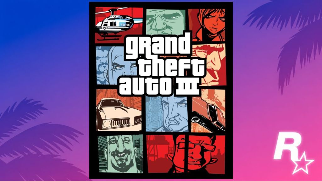
GTA 3 (2001)
On a rainy lunch break I flipped the cover over and noticed the blocky grid — it read like a menu of sins.
GTA 3 arrived in October 2001 and changed everything: a full 3D Liberty City and the birth of the Pricedown logo. The cover abandoned photos for original artwork arranged in a grid of panels — the tile grid acting as a stained-glass window into Liberty City. Each pane teases characters and moments: helicopters, mob faces, muscle cars. That panelled format became the franchise’s visual DNA.
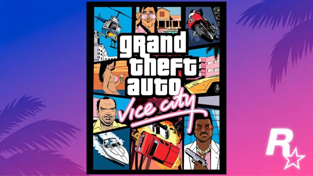
GTA Vice City (2002)
The neon of a downtown arcade still hums in my head when I see that pink-and-teal palette.
Released October 2002, Vice City dressed the franchise in 1980s sunlight and neon. The cover uses a vibrant collage: helicopters, Infernus cars, bikini models, and characters straight out of Miami Vice and Scarface. It sells fantasy and excess; every element screams a specific era and mood. The cover helped cement Vice City as a fan favorite.
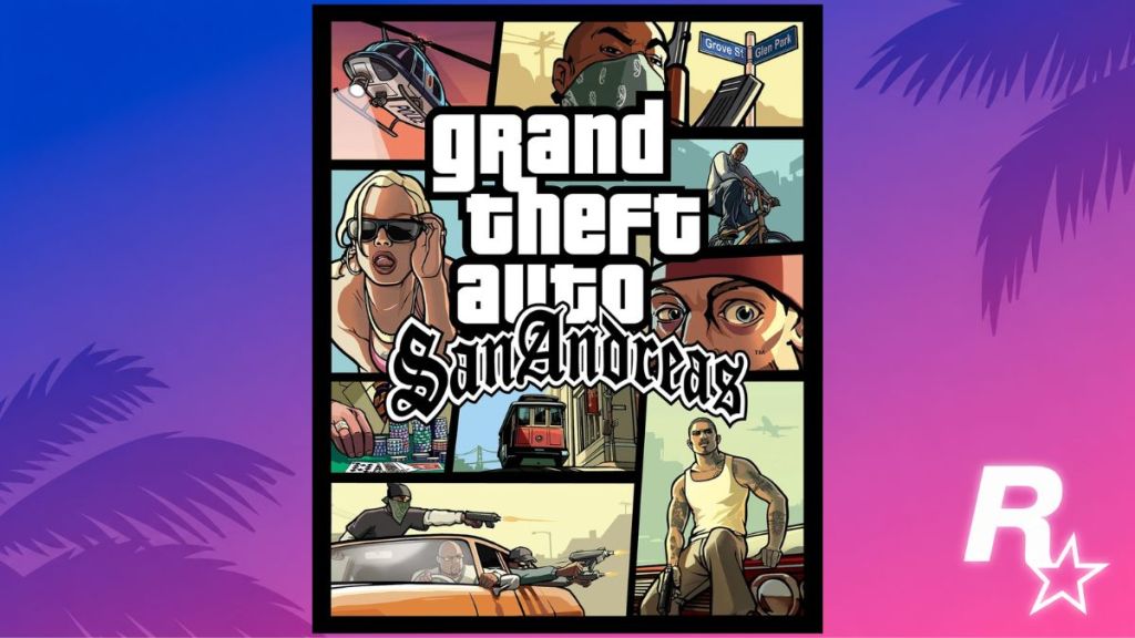
GTA San Andreas (2004)
I used to see San Andreas posters stapled to dorm-room doors — its orange sunset palette stuck with people.
Released in 2004, San Andreas broadened the collage approach with more detail and character focus. The cover showed a police Maverick against a sunset, gang members, CJ on a BMX, and gamblers’ chips — a sprawling portrait of West Coast crime culture. It captured the game’s scale: family, territory, and small-town tragedy played out on a massive map.
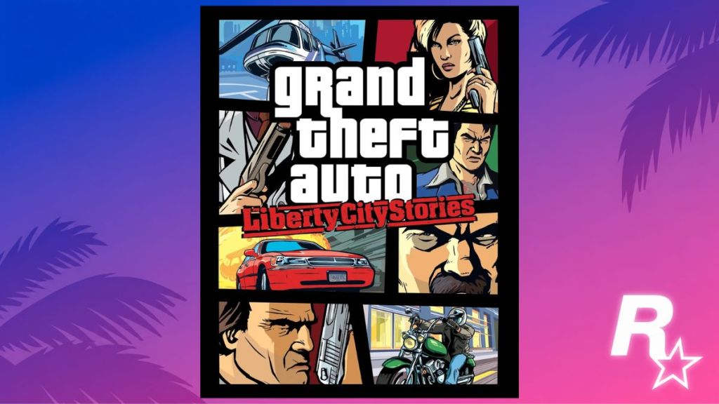
GTA Liberty City Stories (2005)
The PSP shelf was tiny; the box art had to shout to be noticed.
Released in 2005 for PSP, Liberty City Stories uses the familiar collage, but scaled for handheld appeal. Helis, mob bosses, motorcycles, and explosions appear in tight frames. The art condensed Liberty City’s factions into a portable promise: nostalgia and sequel groundwork for GTA III fans.
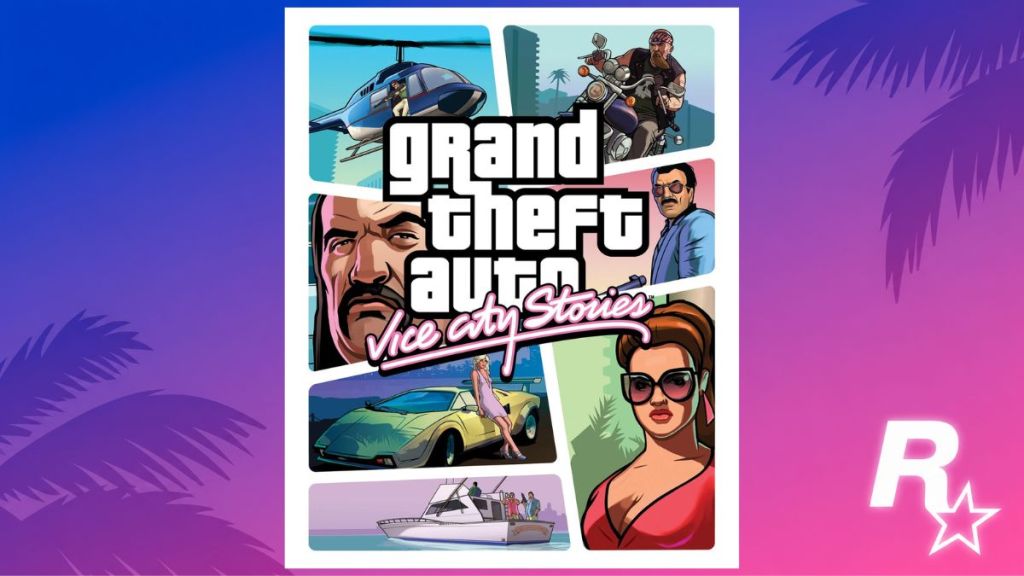
GTA Vice City Stories (2006)
I saw the white-bordered cover in a thrift shop window — it felt sunnier than the other boxes.
Vice City Stories (2006) kept the neon soul but softened edges with a white border. Helicopters, bikers, bikinis, and door gunners populate the frame. The art suggests action on a personal scale: a soldier-turned-criminal, small crews, and big heat. It’s Vice City distilled to hand-held drama.
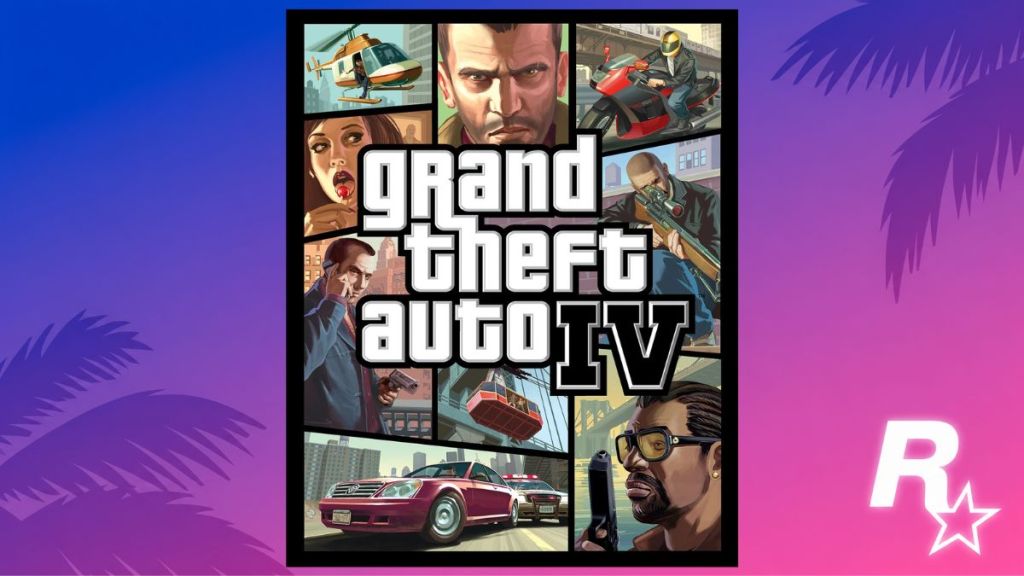
GTA 4 (2008)
I caught a glimpse of the Algonquin Bridge on the cover and felt the city were colder than before.
GTA 4 (2008) introduced Niko Bellic and a grimmer tone. The art shrank the bright palette into moodier contrasts: shadowed faces, subway lines, and tense close-ups. Niko appears as both a gunner and a portrait; the cover reads like a noir poster. It signaled a tonal shift toward character-driven storytelling.
GTA 4: Episodes From Liberty City (2009)
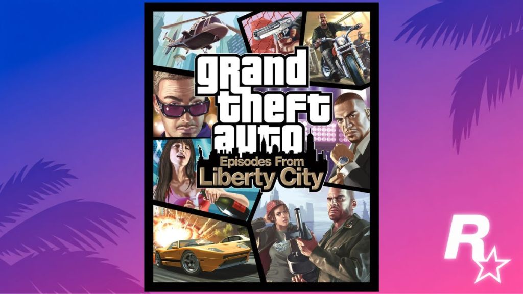
The standalone case sat on a cashier’s counter with DLC stickers — it felt like extra lives for a city you thought you knew.
Episodes from Liberty City (2009) bundled The Lost and Damned and The Ballad of Gay Tony. The art pulls characters and action from both expansions: paratroopers, bikers, and nightclub glamour. It’s an anthology box, promising variety inside the same grim metropolis.
GTA Chinatown Wars (2009)
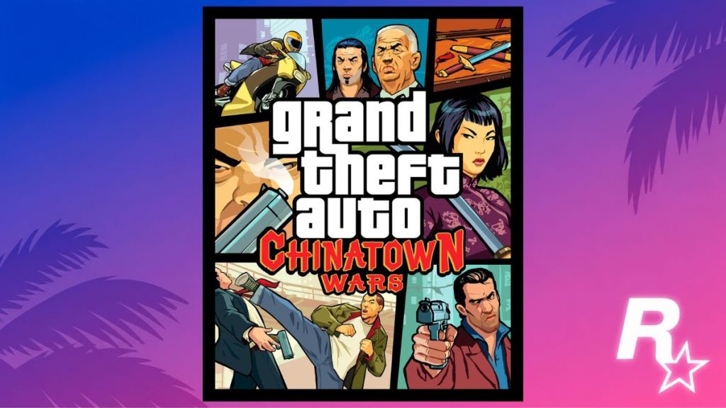
I watched a friend play this on a handheld in a café — the cover felt loud and immediate at pocket scale.
Chinatown Wars (2009) began on Nintendo DS and later hit PSP and mobile. Its cover uses vivid panels and punchy colors tailored to a smaller screen. Huang Lee appears in motion, swords and pistols pop against bright backdrops — the art signals handheld intensity and a different narrative voice inside Liberty City.
GTA 5 (2013)
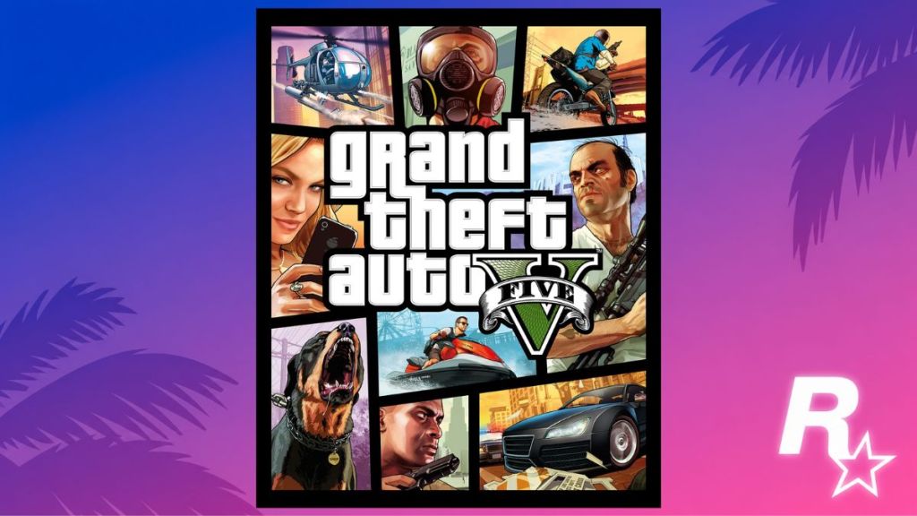
The launch-day queue outside the store felt like a declaration — gamers clutching their copies like badges.
GTA 5 (2013) brought three protagonists and a sunlit Los Santos. The cover became a busy, cinematic tableau: Buzzard choppers, gas-masked robbers, Franklin on a bike, Trevor with a sniper, and Chop the dog. It mirrored the game’s heist structure and glossy production values. The art invites you into set pieces rather than a single character’s story.
GTA 5 Online (2013)
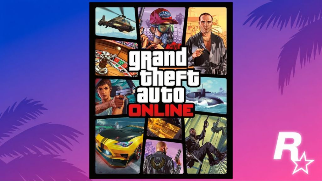
At parties I’d watch streaming crews talk about updates — the cover art expanded as the game itself expanded.
GTA Online’s cover folds years of content into one image: Kosatka submarines, Akula helicopters, The Diamond Casino, and heist loot. It’s a catalogue of meta-content aimed at players who already know the world — proof that art can sell ongoing updates as much as a boxed product.
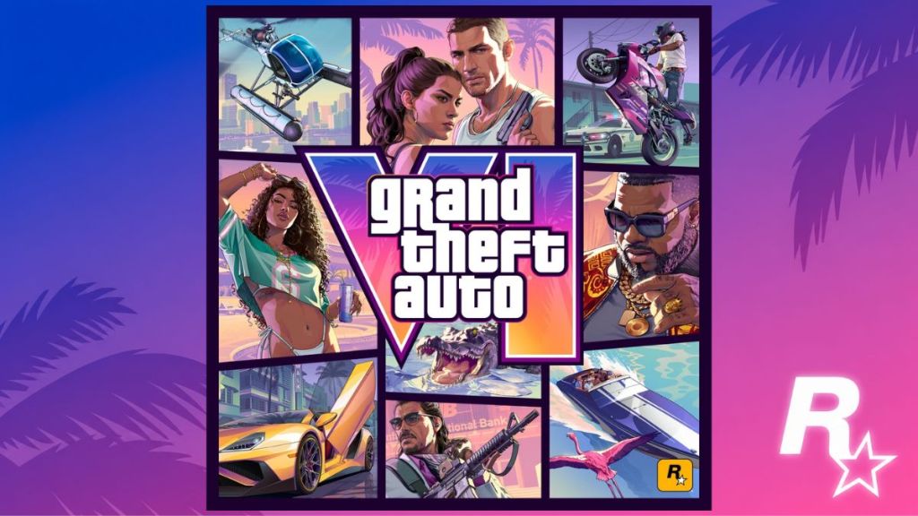
GTA 6 (2026)
I watched the reveal trailer on a streamed pre-order night with thousands of comments flying by — anticipation was seismic.
GTA 6 ships November 19, 2026, and the cover returns to the helicopter-and-collage format that fans expect. Jason and Lucia headline the panel, a Sea Sparrow helicopter hovers, and neon Vice City vibes mix with modern grit. Rockstar leans into character pairings and brand callbacks; every chosen prop — bikes, boats, supercars — signals gameplay beats and heist setups. This is marketing honed for an audience that reads small details like clues.
After nearly three decades, the covers reveal more than art choices — they map Rockstar’s marketing instincts and shifting player expectations across platforms and eras. Which cover still catches you off guard and why will you defend it online?