
I watched the White House account post a bizarre Zelda clip two days after voters spoke, and I felt the room tilt. You can almost see the timing register as a misstep. It hit like a wrong note at a funeral.
It’s dangerous to go alone! Take this pic.twitter.com/masCWWQe7m
— The White House (@WhiteHouse) November 5, 2026
I’ll be blunt: you and I both know how political spin is supposed to work. This felt more like an intern’s late-night experiment than a message strategy. The red MAGA hat is gone; the cap now reads “Still your President”, which reads less like a rallying cry and more like a desperate memo stapled to a sinking ship.
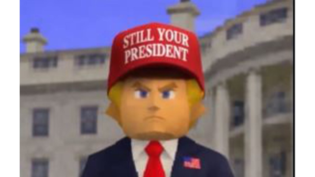
Two days after a heavy midterm defeat, the White House posted a Zelda-inspired clip.
The calendar is the first glaring fact: a message like this should read as pre-game cheer or culture play, not as a post-loss volley. You notice the mismatch immediately — timing matters more than flash. After a campaign season that cost energy and credibility, the video’s arrival felt tone-deaf rather than strategic.
Why did the White House post an Ocarina of Time video?
Because someone thought a pop-culture tie-in would humanize the account on X. In theory, tying to Nintendo’s The Legend of Zelda: Ocarina of Time remaster is a way to catch an organic trend on social platforms like X and YouTube. In practice, the clip read as a self-endorsement wrapped in nostalgia, and that’s a thin wrapper to disguise a political ask after an electoral loss.
The visuals looked like a corrupted ROM playing through an AI filter.
Watch the clip and you’ll see what I mean: Trump dashes through a flattened corridor toward the Deku Tree while a canned list of “achievements” scrolls. The remaster’s selling point — updated graphics — is absent; instead we get a mushy, AI-processed pastiche.
This feels like output from an image model stitched to a cheap animation pipeline: think Stable Diffusion or Midjourney doing a game-skin, then composited in a basic editor. The result is uncanny and cheap, not slick. It’s a reminder that generative tools can magnify an idea’s flaws as fast as its virtues, like a paper airplane tossed into a hurricane.
Was this video made with AI tools?
Everything about the clip points to generative models and quick compositing: inconsistent lighting, face artifacts, and a mismatch between the “remastered” claim and the visuals shown. Platforms like X and YouTube host and amplify this content, but they didn’t create the aesthetic — internal teams or vendors using AI did.
The messaging reads like a self-endorsement trying to feel organic.
Look at the copy: “It’s dangerous to go alone! Take this.” It’s playful until you remember who posted it. The phrase stacks nostalgia, patriot emoji, and a Trump-centric narrative into one short line. You can smell the intent behind the wink: keep the brand visible, deflect the loss, and remind followers of an outside-the-mainstream status.
That tactic can work when timed before a wave of attention — not after voters have already left the building. Instead of shifting the conversation, it amplified the awkwardness. The hat that now reads “Still your President” reads less like a slogan and more like a sticky note on a closed door.
The political cost will be judged in small, cumulative signals.
Officials and strategists will parse this as another data point: tone-deaf content, poor timing, and sloppy execution. Those things compound. You don’t need a single viral failure to change a political trajectory; you need a pattern, and this adds to one.
Brands and campaigns are watching, too — from Nintendo to platform teams at X and YouTube, anyone who cares about IP or reputation will file this under “how not to use nostalgia.” Lawyers and brand managers will note the unauthorized mash-up, and community managers will cringe at the mixed signals.
I’m asking you: when messaging misses the moment this badly, is it incompetence, a calculated distraction, or something else entirely?